Bringing together Code & Design to showcase expertise, improve SEO results, and create an improved user experience.
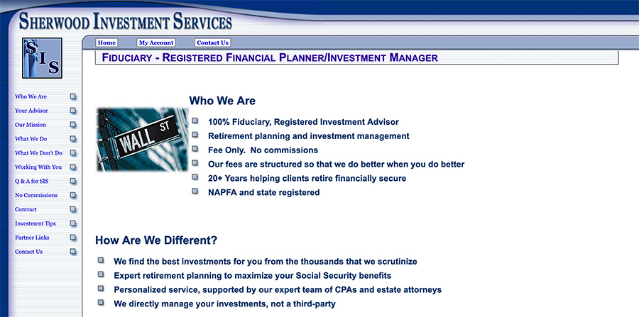
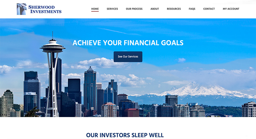
When Sherwood Investments contacted us, they had a confession to make. They knew for many years that their website was out of date – it had been built over 10 years ago, and was not a mobile responsive website – but they didn’t know where to start. They contacted Bombastic to learn more about not only how they should redesign their site, but what improvements would help drive more traffic and result in more customer leads.
During our first meeting, we explained that moving to a mobile-first coding platform has many implications for any website. It’s not just a way to write the code (so that it recognizes what kind of device the user is on, and reformats automatically), it requires a new thinking when it comes to the content. Mobile-first websites:
- ensure that content is easily scannable (check out a past Bombastic Blog post for more on this topic),
- have vibrant photos that get quickly delivered no matter what kind of internet connection,
- deliver information to the user on the web page itself, eliminating PDFs and other documents,
- have a clearly organized navigation structure that quickly guides the user to the information they seek (so the user doesn’t leave the site in frustration).
That meant: Sherwood Investment’s website not only needed a new coding platform, it needed to build on that foundation with a design that would showcase all they had to offer.
A comprehensive redesign plan
The first order of business was to choose the best coding platform for Sherwood. As they create and publish newsletters for their clients, and need to periodically update the site themselves, we went to work with WordPress. This allowed us to migrate the past newsletters from PDFs into a blogging structure that was searchable, met accessibility standards, and would boost search engine results.
Next, we thoroughly reworked the content. Being that search engines prioritize contextualized, semantic content, we moved away from the many bulleted lists and into detailed paragraphs. The site layout was redesigned to adapt to usability standards users now expect, with an intuitive customer journey throughout the site.
Then, the visual balance of the site was improved. As research has proven that images are critical to a website’s success, we added custom graphics and updated photos that were formatted and optimized for various devices. We edited their existing logo to help it better meet today’s size, layout and resolution requirements.
To keep the process smooth and optimize communication with Sherwood, all of the redesign work was done on a draft site hosting location. We checked in with Sherwood often, collaboratively refining the text and dropping in photos as needed. Only once the site was fully polished did it go live.
A successful website must be built with an eye towards the Art & the Science of web design.
As this project proves, understanding HTML code is not enough to build a mobile-first website. It’s the combination of the latest in coding standards with a firm understanding of the art of design. As one of the top web design companies, everyone at Bombastic is dedicated to staying on top of the latest research and trends, always delivering the best in web design for our clients.